CSS Style Support
CSS Properties
width
Set default width; unit default or dp
  width: 15;
  width: 15dp;
min-width
Set minimum width; default is 0; unit default or dp
  min-width: 15;
  min-width: 15dp;
max-width
Set maximum width; default is WIDGET_MAX_WIDTH (macro in code); unit default or dp
  max-width: 15;
  max-width: 15dp;
height
Set default height; unit default or dp
  height: 15;
  height: 15dp;
min-height
Set minimum height; default is 0; unit default or dp
  min-height: 15;
  min-height: 15dp;
max-height
Set maximum height; default is WIDGET_MAX_HEIGHT (macro in code); unit default or dp
  max-height: 15;
  max-height: 15dp;
color
Set text color; supports rgb and rgba
    color: rgb(38, 38, 38);
    color: rgba(38, 38, 38, 1.0);
sub-color
Set secondary color; effective for some components like TpSlider, TpPercentProgressBar; supports rgb/rgba
    sub-color: rgb(140, 29, 235);
    sub-color: rgba(140, 29, 235, 1.0);
background
Set background color; supports rgb, rgba, and gradients
    background: rgb(255, 255, 255);
    background: rgba(255, 255, 255, 1.0);
    background: linear-gradient(90deg, rgb(107, 80, 246), rgb(204, 143, 237));
background-color
Set background color; supports rgb, rgba, and gradients
    background-color: rgb(255, 255, 255);
    background-color: rgba(255, 255, 255, 1.0);
    background-color: linear-gradient(90deg, rgb(107, 80, 246), rgb(204, 143, 237));
border-color
Set border color; supports rgb, rgba, and gradients
    border-color: rgb(255, 255, 255);
    border-color: rgba(255, 255, 255, 1.0);
    border-color: linear-gradient(90deg, rgb(107, 80, 246), rgb(204, 143, 237));
border-width
Set border width; default is 1px; unit default or dp
    border-width: 1;
    border-width: 1dp;
font-size
Set font size; unit default or dp
    font-size: 18;
    font-size: 18dp;
gap
Set internal element spacing; unit default or dp
    gap: 3;
    gap: 3dp;
padding
Set distance from inner elements to all edges; when padding is set, padding-left/right/top/bottom are ignored; unit default or dp
    padding: 3;
    padding: 3dp;
padding-left
Set distance from inner elements to left edge; ignored if padding is set; unit default or dp
    padding-left: 3;
    padding-left: 3dp;
padding-right
Set distance from inner elements to right edge; ignored if padding is set; unit default or dp
    padding-right: 3;
    padding-right: 3dp;
padding-top
Set distance from inner elements to top edge; ignored if padding is set; unit default or dp
    padding-top: 3;
    padding-top: 3dp;
padding-bottom
Set distance from inner elements to bottom edge; ignored if padding is set; unit default or dp
    padding-bottom: 3;
    padding-bottom: 3dp;
border-radius
Set border radius; unit default or dp
    border-radius: 3;
    border-radius: 3dp;
icon-size
Set icon size; effective for some components such as TpIconTopButton, TpMediaTileButton, TpMenuPanelItem; unit default or dp
    icon-size: 3;
    icon-size: 3dp;
CSS States
hover
Mouse hover state; set styles on hover
TpButton:hover {
  background-color: rgb(239, 239, 239);
}
active
Mouse active (press) state; set styles when pressed
TpButton:active {
  background-color: rgb(208, 215, 221);
}
checked
Checked state; set styles when selected. Components can enable checked state; clicking toggles between selected and unselected.
TpButton:checked {
  background-color: rgb(208, 215, 221);
}
disabled
Disabled state; set styles when the component is disabled
TpButton:disabled {
  background-color: rgb(208, 215, 221);
}
enabled
Enabled (default) state; set styles for enabled/default; may be implied by omitting the pseudo-class
TpButton:enabled {
  background-color: rgb(208, 215, 221);
}
TpButton {
  background-color: rgb(208, 215, 221);
}
Custom Type Selector
Filter styles by type to target specific components. Use the type attribute in CSS and bind the type in code.
TpButton[type="ControlPanelPowerButton"] {
    height: 64dp;
    width: 305dp;
    font-size: 18dp;
    color: rgb(38, 38, 38);
    background-color: rgb(255, 255, 255);
    border-radius: 32;
}

TpButton[type="ControlPanelPowerButton"]:hover {
    background-color: rgb(239, 239, 239);
}

// Bind a style type in C++
setProperty("type", "ControlPanelPowerButton");
Usage Example
Create a test app
Create a default application and a TpButton, following the app development guide.
Define custom CSS styles
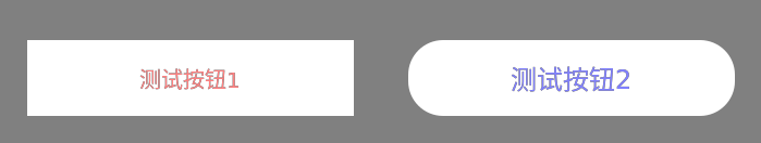
TpButton {
gap: 5dp;
font-size: 15dp;
color: rgb(255, 128, 128);
background-color: rgb(255, 255, 255);
}
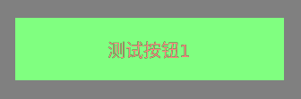
TpButton:hover {
background-color: rgb(128, 255, 128);
}
TpButton[type="TestCssType"] {
height: 64dp;
width: 305dp;
font-size: 18dp;
color: rgb(128, 128, 255);
background-color: rgb(255, 255, 255);
border-radius: 32;
}
TpButton[type="TestCssType"]:hover {
background-color: rgb(55, 55, 55);
}Apply custom CSS styles to buttons
    TpString testCSSStr = "CSS from previous step";
    setStyleSheet(testCSSStr);

    TpButton* testButton1 = new TpButton("Test Button 1", this);
    testButton1->setSize(300, 70);
    testButton1->move(150, 150);

    TpButton* testButton2 = new TpButton("Test Button 2", this);
    testButton2->setProperty("type", "TestCssType");
    testButton2->setSize(300, 70);
    testButton2->move(500, 150);
Display
Normal
Hover

Copyright
Copyright Ownership:TinyPiXOS
License under:Attribution-ShareAlike 4.0 International (CC-BY-SA-4.0)
